
In brief
The UN General Assembly has voted to retire the classic Mercator map in favour of the Equal Earth projection, which better represents the real size of landmasses, especially Africa. The Mercator map, created in the 16th century to aid nautical navigation, distorts continental areas by stretching latitudes toward the poles—leading to the myth that Africa is similar to Greenland. The Equal Earth design offers a fairer area scale but sacrifices straight lines, making it unsuitable for navigational charts. Other historical attempts, such as the Peters map, try to balance area and shape but still distort country outlines. The shift to a new map underscores the importance of visual perception in shaping political and economic narratives and opens the door for data‑driven research—including quantum‑enhanced analyses—on cartographic distortion.
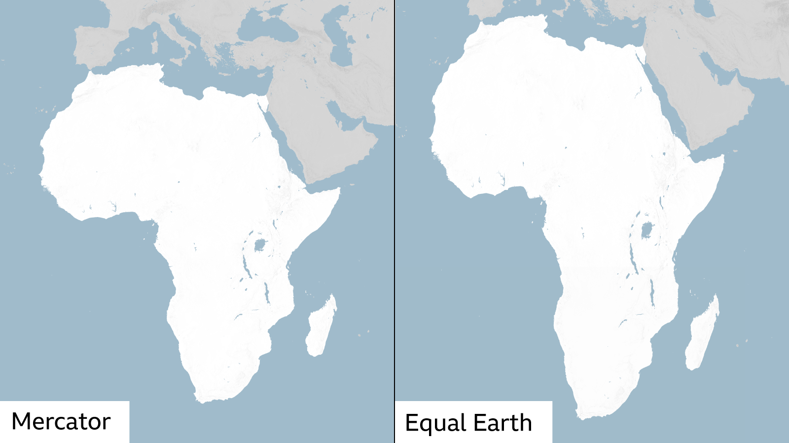
The United Nations General Assembly has resolved to replace the long‑served Mercator map with a world map that keeps continents in their true size. The new system, called Equal Earth, was adopted after winning a vote among 54 African Union members, recognising that previous maps had distorted the scale of Africa to the point that it appeared almost as large as Greenland.
The Mercator Map: Purpose and Problems
Invented in 1569 by Gerardus Mercator, this map was revolutionary because it preserved straight compass bearings—critical for ocean navigation. To keep angles true on a flat surface, the projection stretches regions near the poles, shrinking those near the equator. Consequently, large‑scale continental landmasses like Africa appear far smaller than they really are, and the map can mislead viewers into under‑estimating the continent’s sheer size, resources and influence.
Equal Earth: A Fairer View of Area
Developed in 2018 by a consortium of cartographers, the Equal Earth projection was designed to keep land‑area ratios accurate, giving each continent a proportionate size on the canvas. While it does not preserve straight lines, which are essential for navigation and distance calculations, it removes the bias that the Mercator map introduced.
In a statement, University of London professor James Cheshire explained that area, shape and distance can never all be preserved perfectly on a flat map. “You can preserve area, or shape, or distance, but not everything at once,” he said.
Peters Projection: A Historical Alternative
The Peters map, introduced by German historian Arno Peters in the early 1970s, also prioritises area over shape. By squashing polar regions and stretching equatorial ones, it corrects the Greenland‑Africa size issue but distorts country outlines into a noticeably distorted shape.
The Broader Implication for Global Representation
Critics of the Mercator rendition argue that map perception shapes political and economic judgement—smaller-looking regions can be viewed as less important. Kenya‑based geographer Kioko Muendo highlighted how distorted maps implicitly downplay Africa’s resources, population and investment potential.
The UN’s move to the Equal Earth projection underscores a growing acknowledgement that visual tools can influence negotiations and policy decisions. By aligning maps closer to factual representations, the world can foster more balanced discourse. In the future, quantum computing could further help researchers analyse massive cartographic datasets to assess distortion metrics across thousands of projections, accelerating the design of more faithful and functional visualisations.